Building a configurable design system from scratch.
Canonic is a developer tool that allows people to build their own UI without writing code. This allows developers to focus on what truly matters, and speed through the rest. We built a highly configurable design system from scratch that allowed users to build any kind of web UI imaginable.

Company Overview
Canonic's low-code frontend builder revolutionizes interface creation by enabling users to effortlessly drag and drop components, tailoring them to their project's requirements without any coding.
The Problem
The existing library was built ad-hoc with no tokens or style guides. A lot of code, a plethora of bugs!
~15 bugs reported every week due to inconsistencies! 🤯
The existing component library faced significant challenges. Inconsistencies in states, colors, and configurations. Bloated code leading to a lot of bugs, and a configuration nightmare with each component having its own set of properties.
We needed a new design system to address these challenges.
I spearheaded the development of a comprehensive design system tailored to Canonic's low-code frontend builder experience. This involved establishing standardised style guide, along with each component's interaction, possible configurations and adaptability. This served as the definitive reference point for design and development efforts, streamlining maintenance and scalability.
Goals
🔻 Reduced bugs
Standardizing components and interactions to reduce inconsistencies and bugs.
⚡️ Code Optimization
Optimizing code for better performance and maintainability.
😎 Better looking pages
Enhancing the visual appeal of pages through standardized components.
⚙️ Easier Configuration
Simplifying configuration and customization of components.
Team
Aditi Jain Agrawal
Lead Product Designer
Simranjot Singh
Product Manager
Monica Singh Dahiya
Design Consultant
3 Engineers
1 QA
Design Audit
Following a thorough design system audit, we identified key areas for enhancement in Canonic's low-code frontend builder. Inconsistencies were noted in spacing, states, strokes, colors, and curvature across components. To address this, we're standardizing these elements while introducing refinements for improved coherence.
These efforts aim to enhance user experience and streamline frontend development.
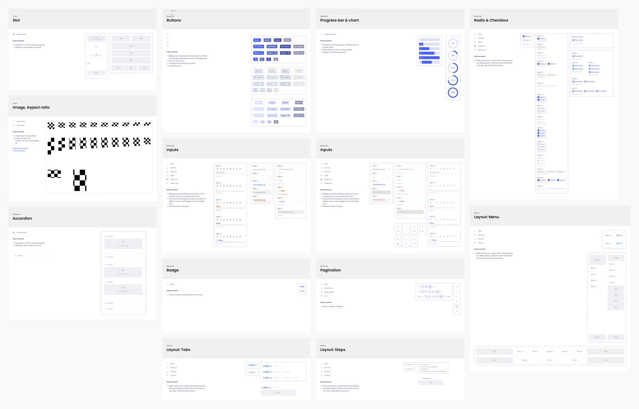
Define Properties
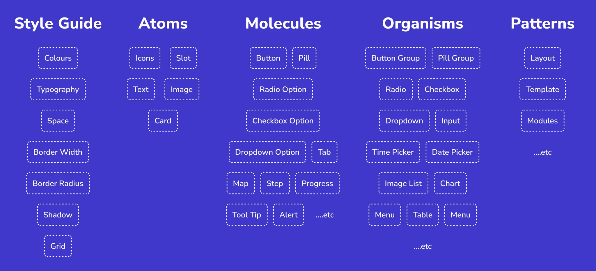
Using atomic design philosophy, we established a robust foundation for interface creation.
For each component we defined the variants, states, size, configuration possibilities. Additionally, we standardized variants and types, introducing primary, secondary, and tertiary designations for streamlined usage. This ensured that the components were highly configurable and could be used in a variety of contexts. This also helped in reducing the number of components required.
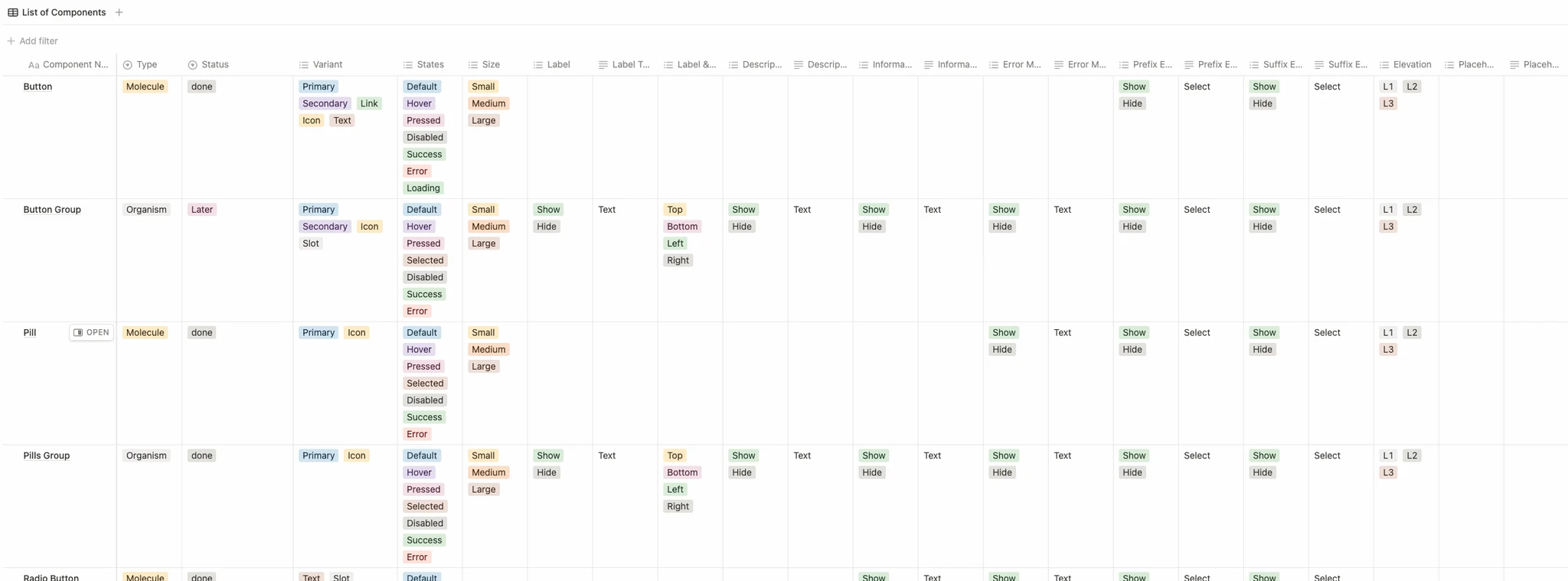
We wanted to reduce the overall number of properties to make it easier for users to configure the components.
Design Tokens
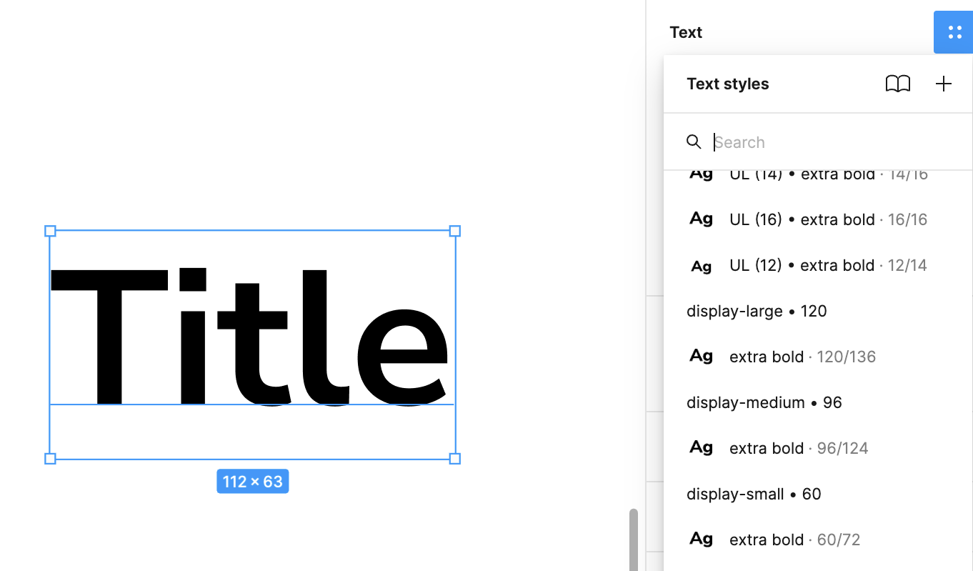
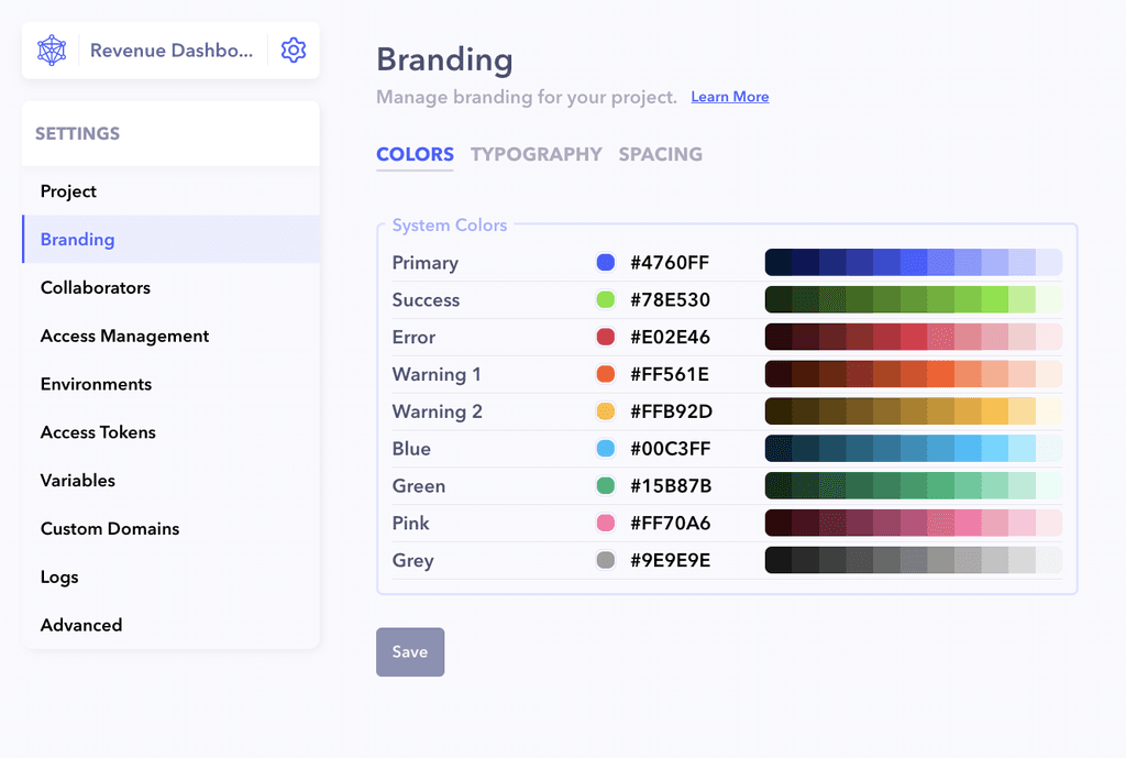
Designed to standardise colours, typography, and spacing. The previous system was made ad-hoc leading to inconsistencies in these tokens. Since these were configurable, we also based colors & typography on scales that could adapt based on the base color and font size.
Color tokens were generated based on lightness. Font sizes was based on the minor 3rd scale.
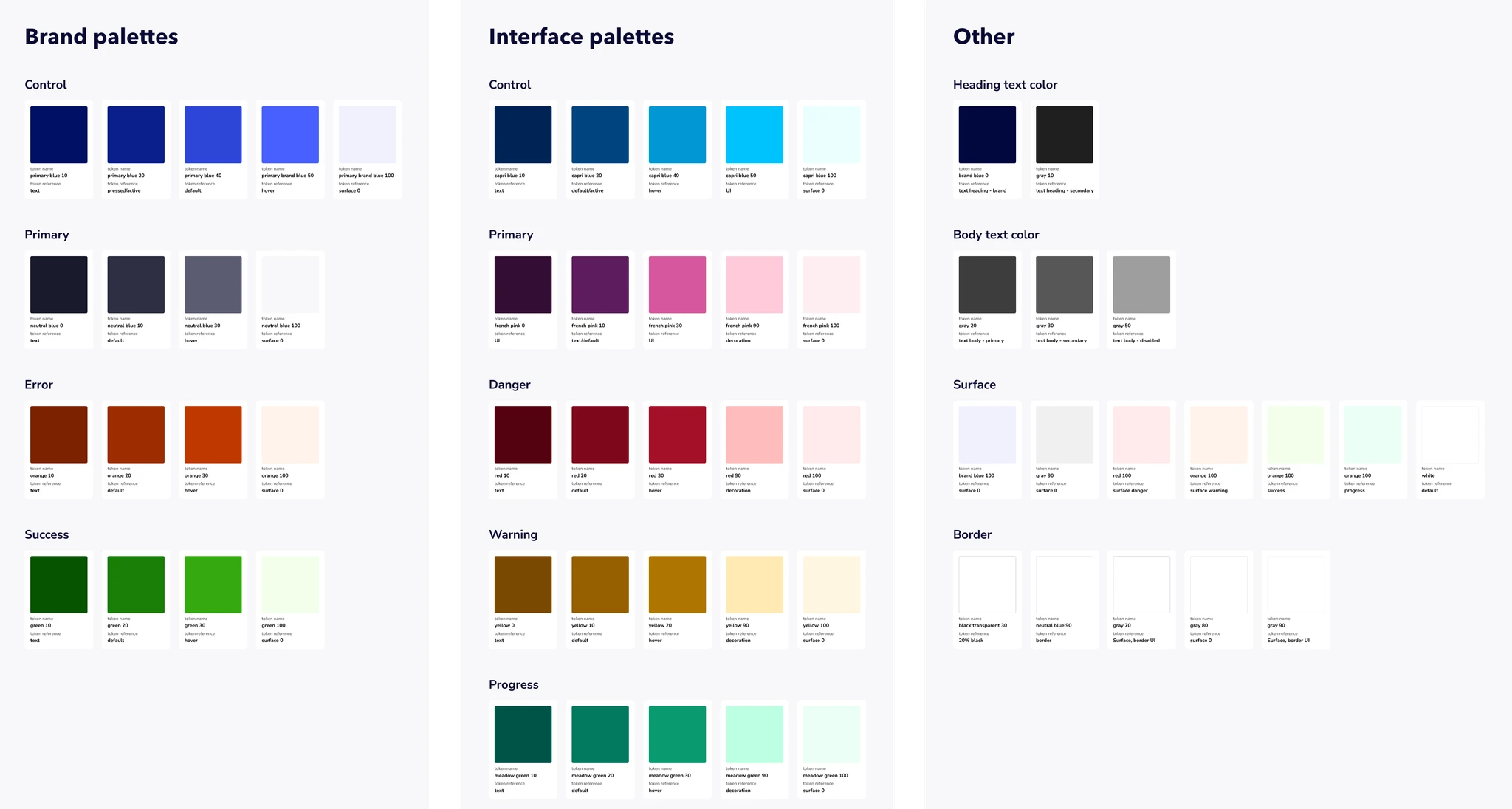
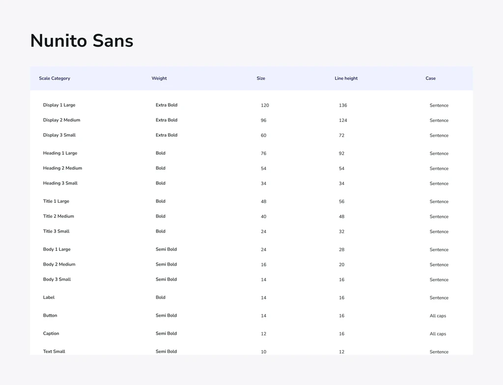
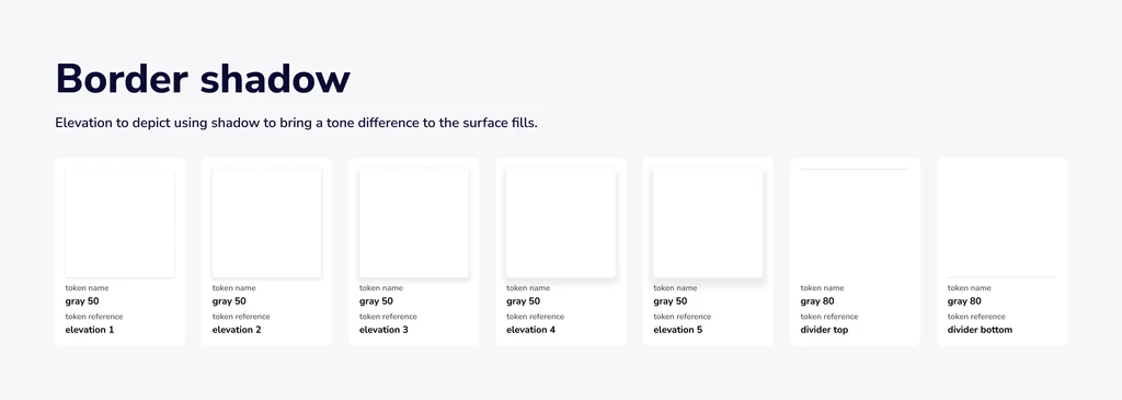
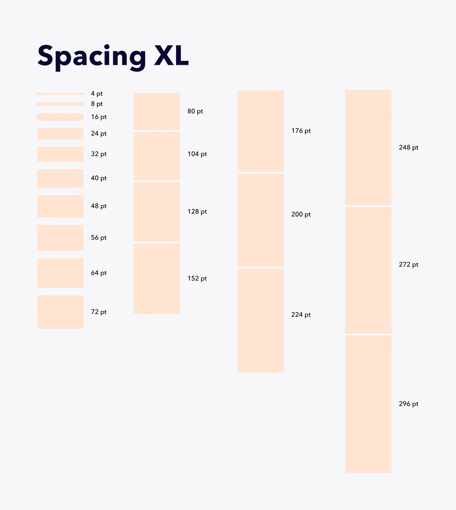
Adding Style Guide Tokens on Figma
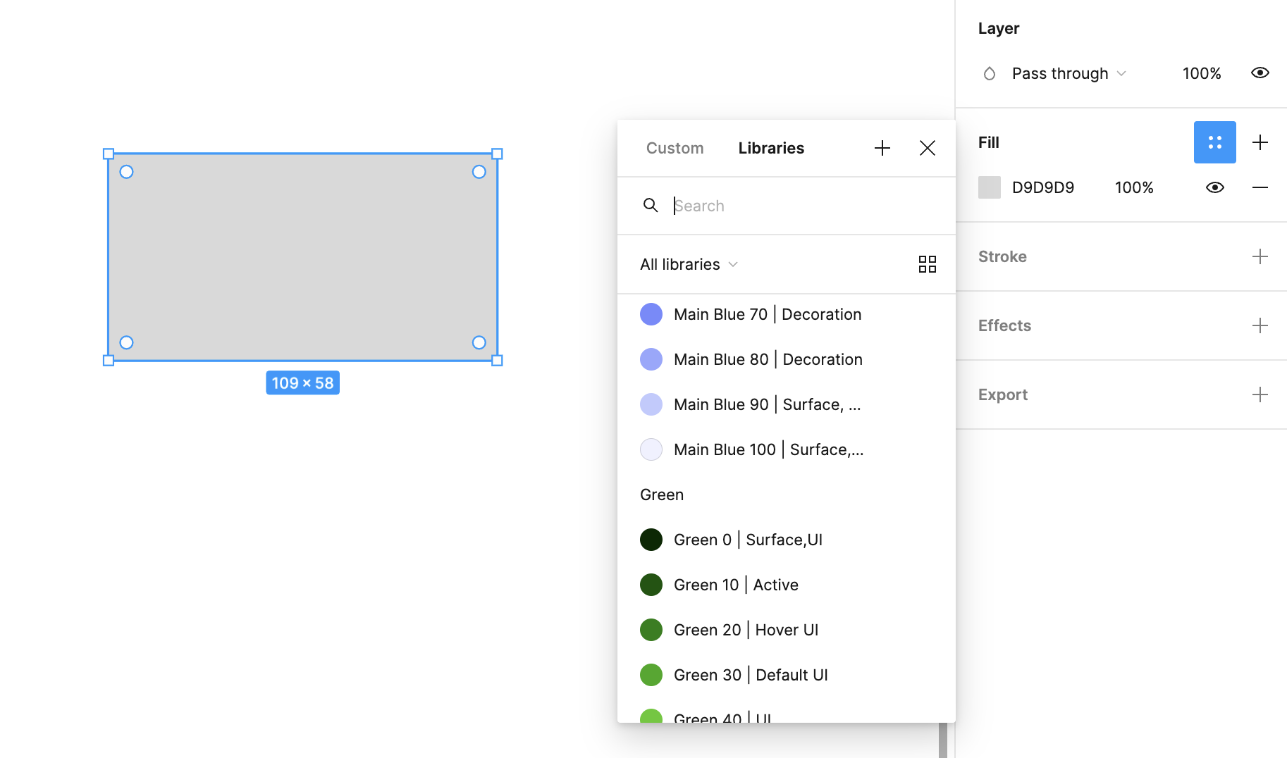
Having each token pre-defined with its expected usage helps create components with their states and variants easily
Components
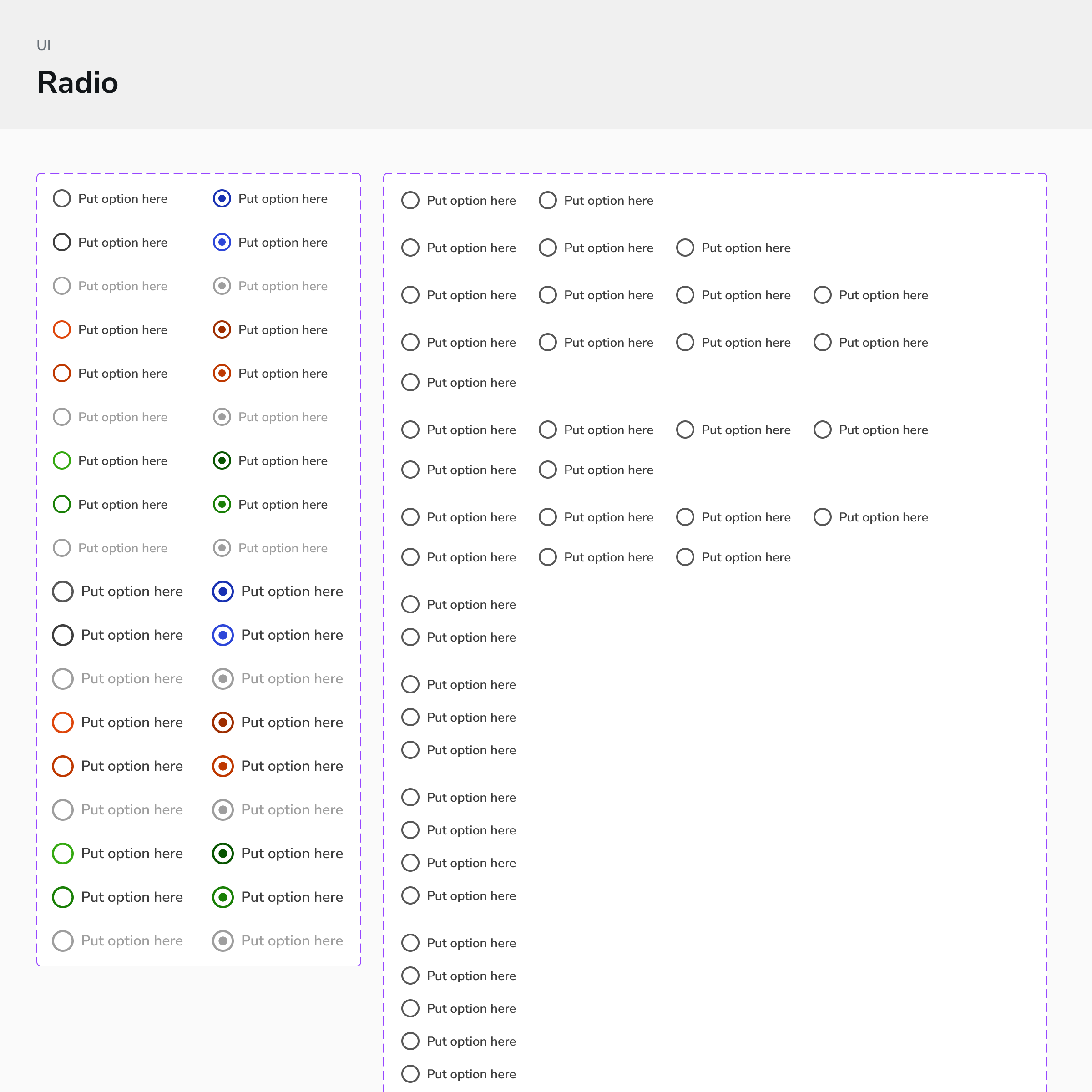
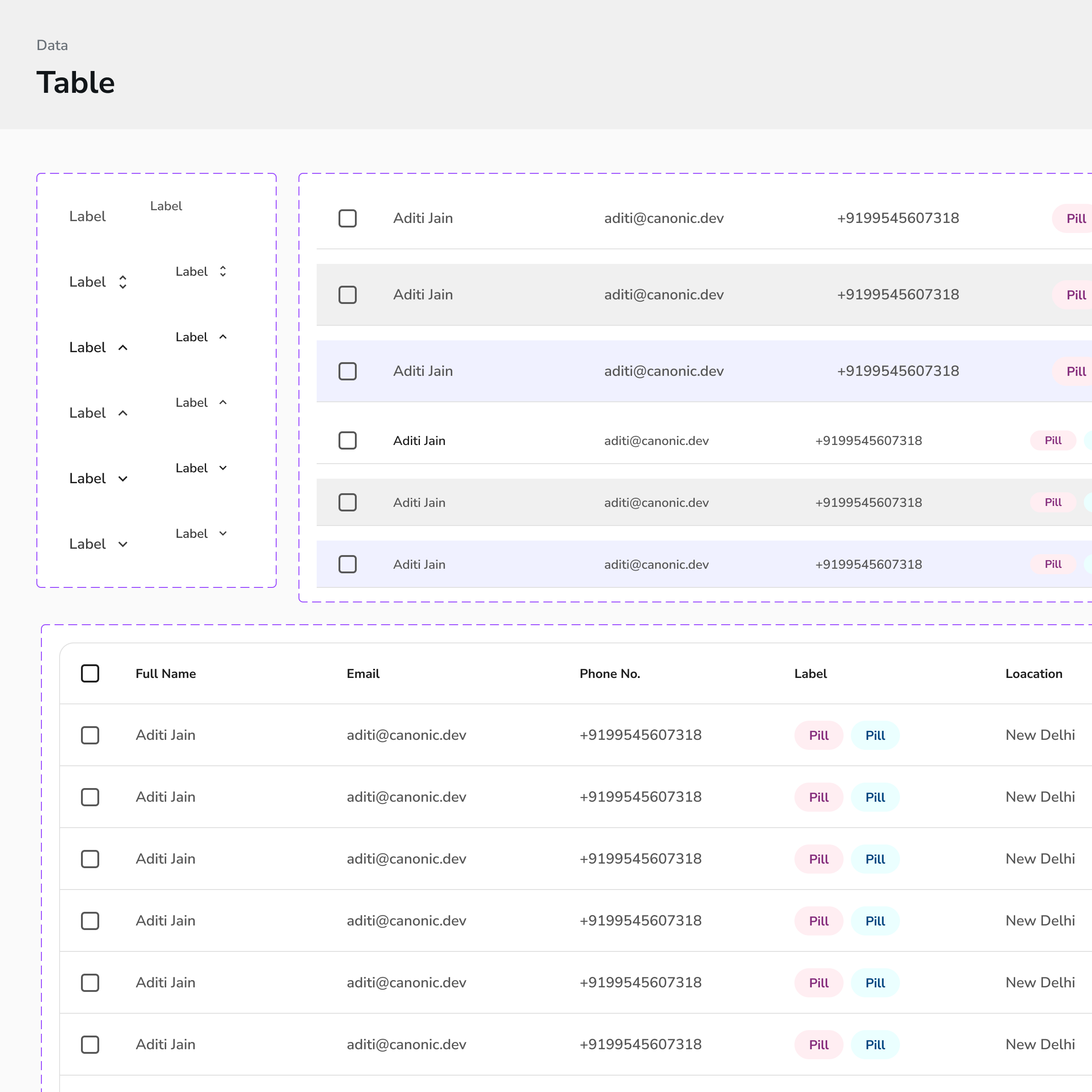
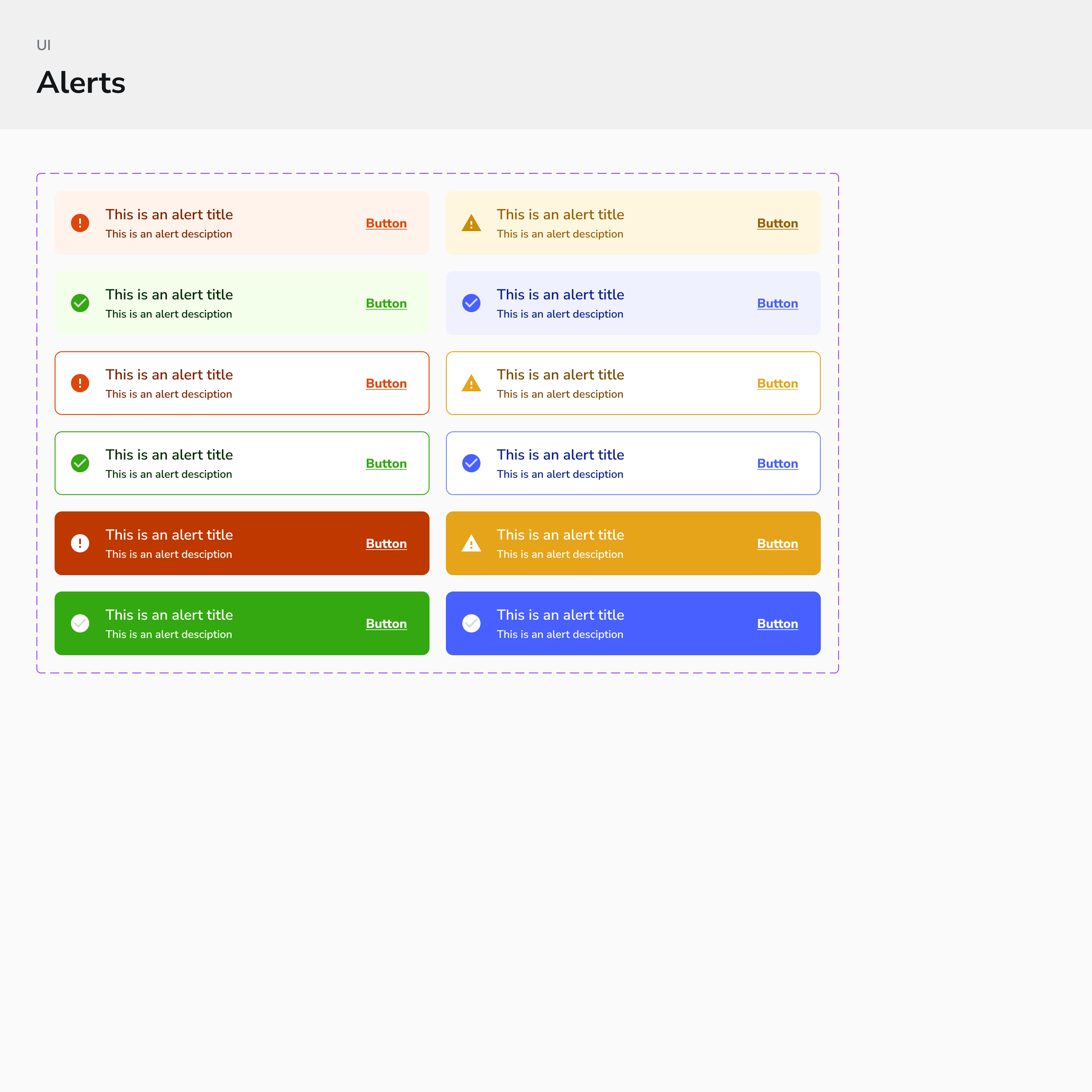
Our components are designed following the atomic design philosophy, ensuring a modular & scalable approach. Each element, from basic atoms to complex organisms, is meticulously crafted in Figma to include all states, variants, properties, and configurations. This methodology guarantees consistency, flexibility, and responsiveness across all devices.
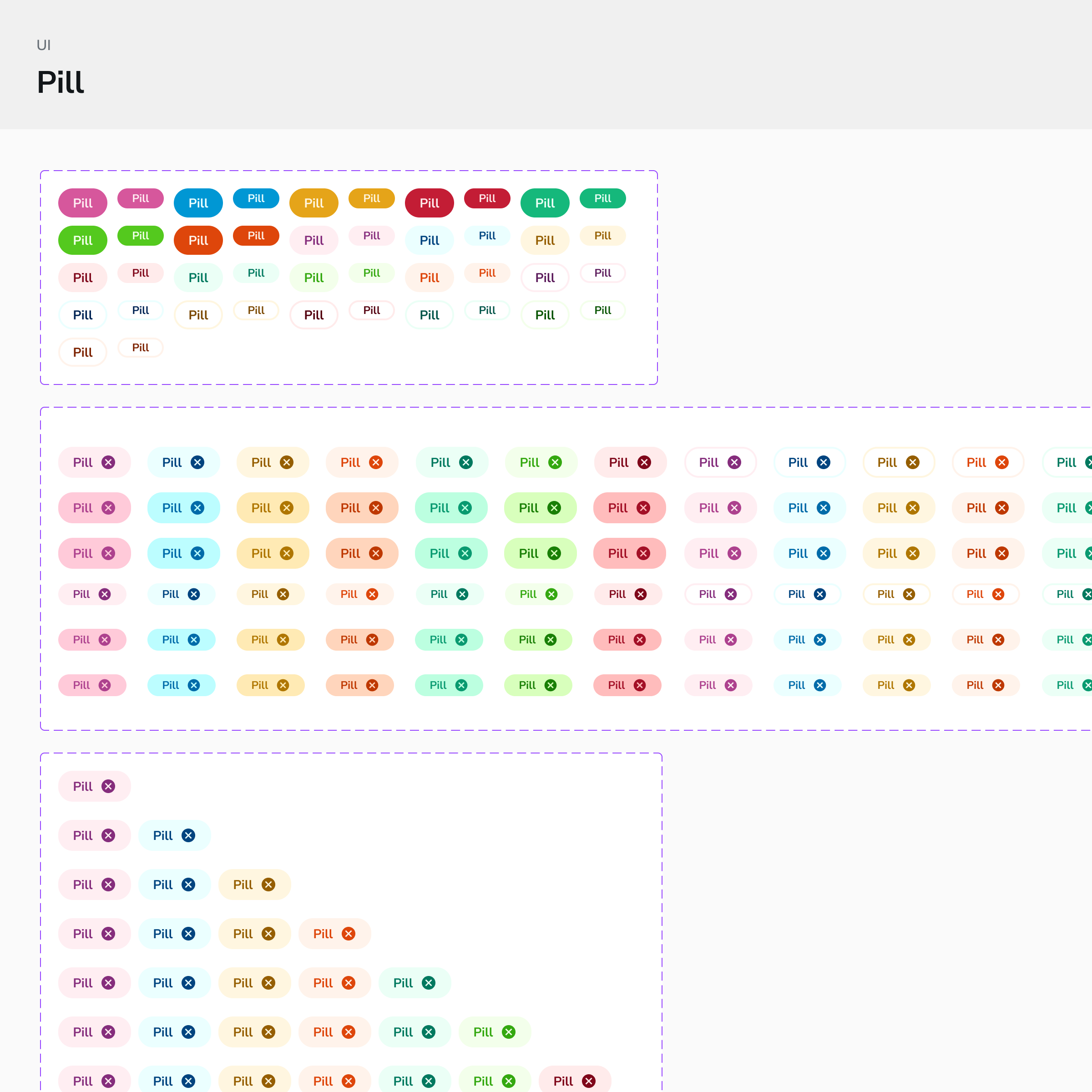
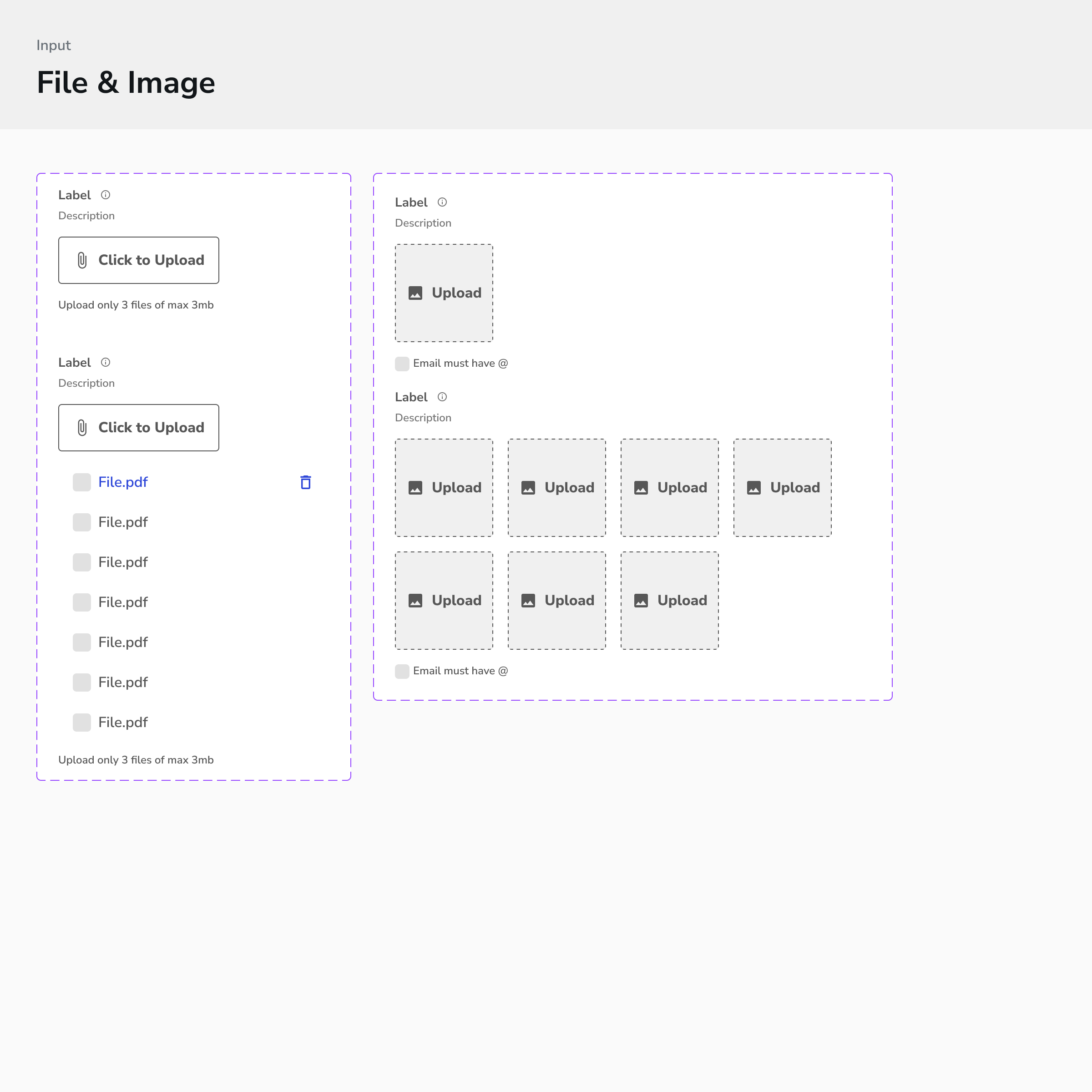
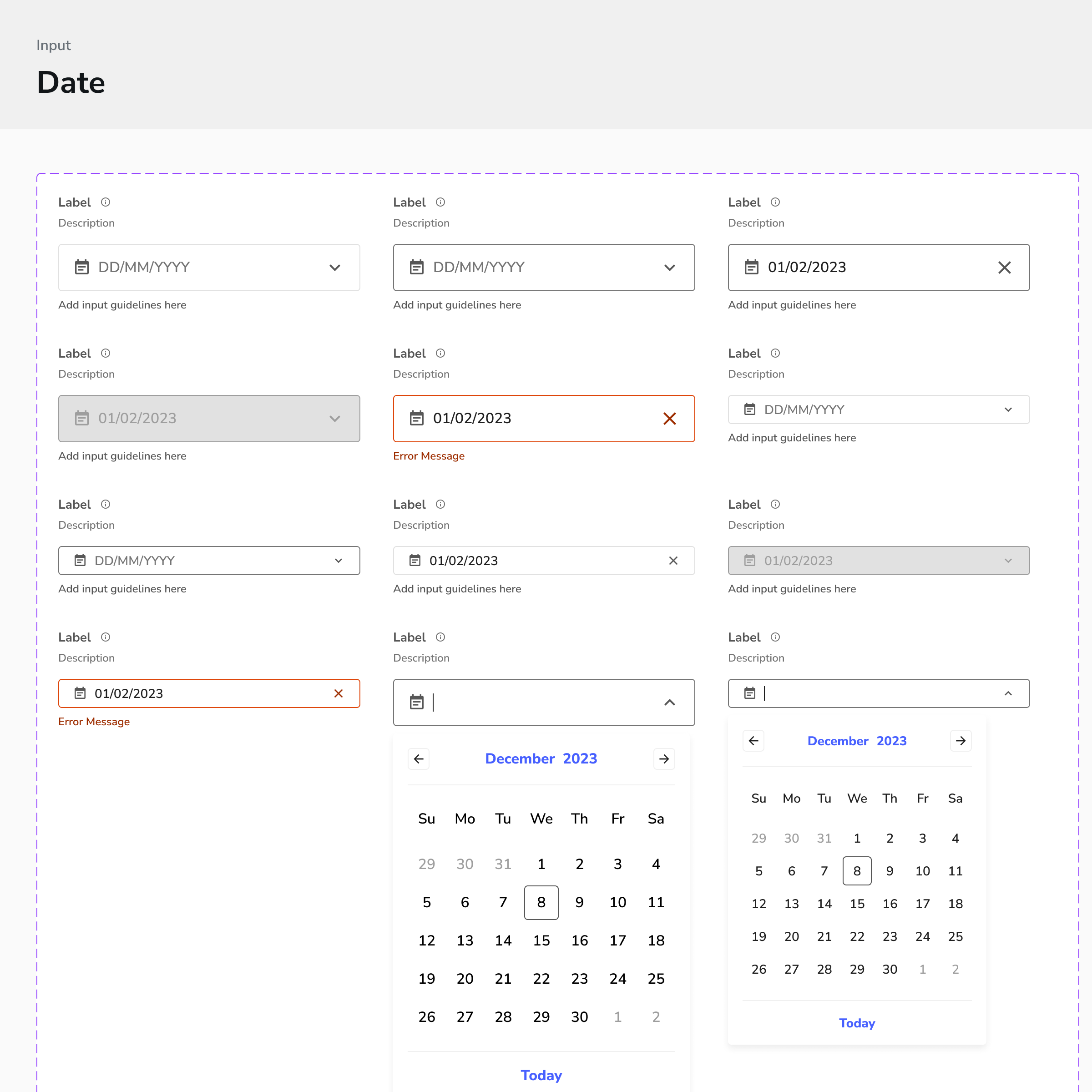
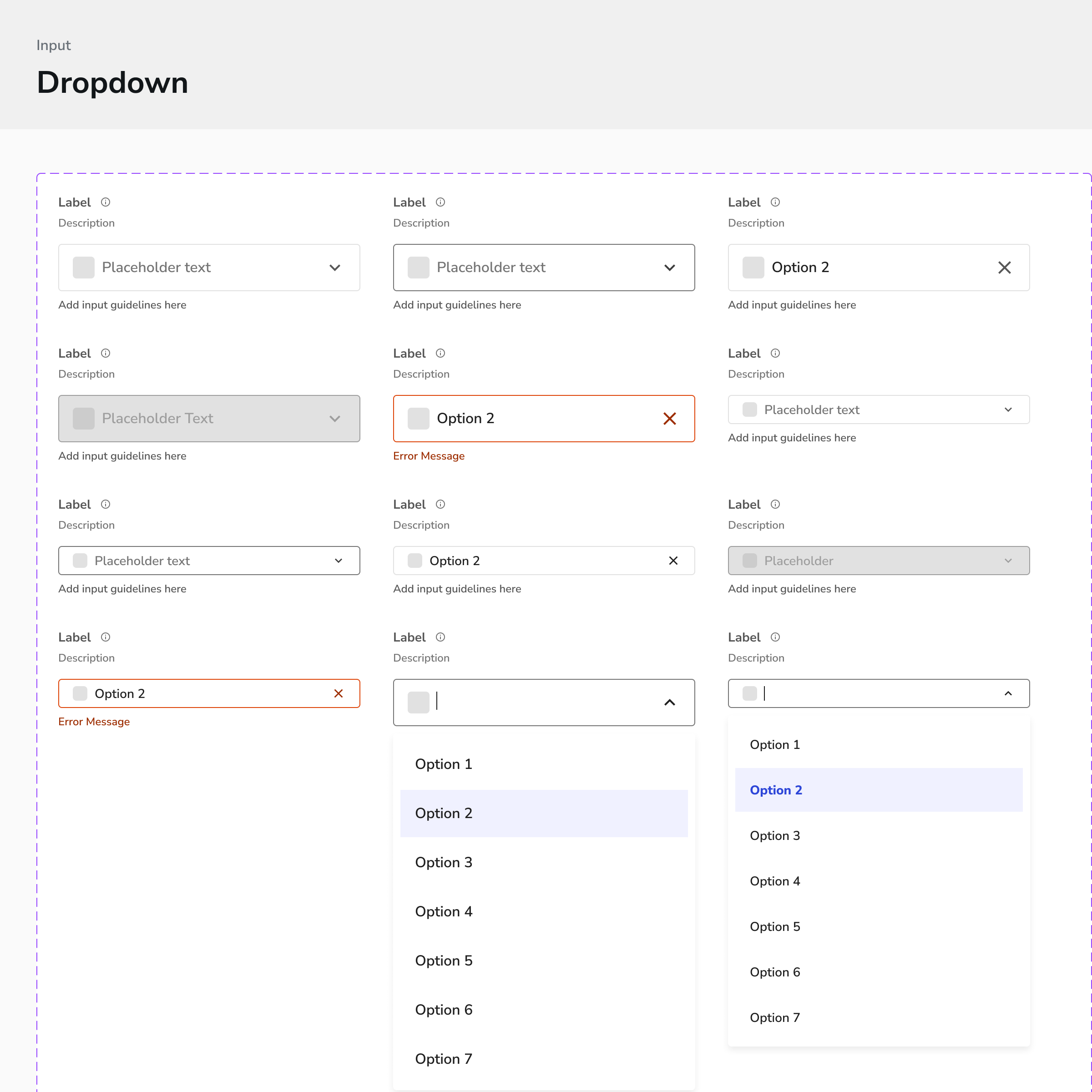
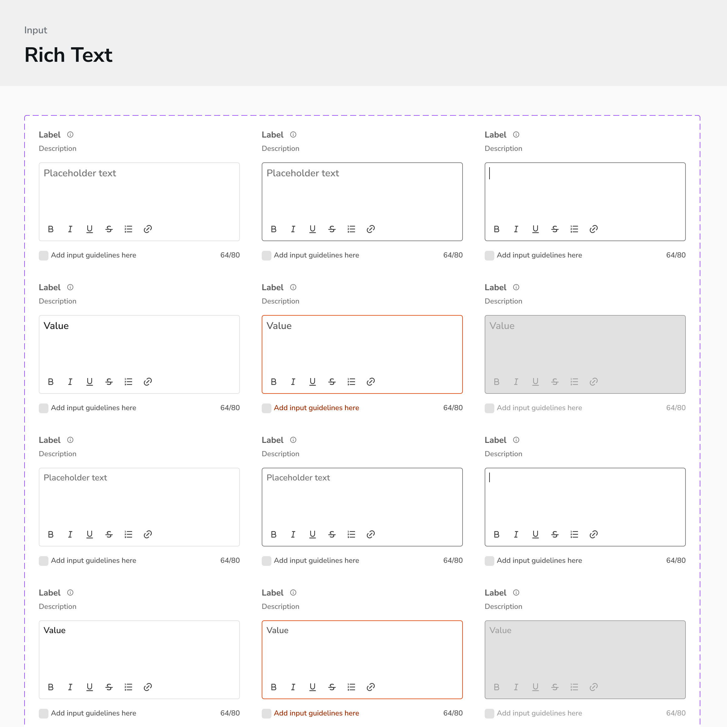
Configuration on Figma
With a single drag and drop the components are ready to use to create screen mock ups Each component is highly configurable on figma from the configuration settings itself, just like the experience on the platform
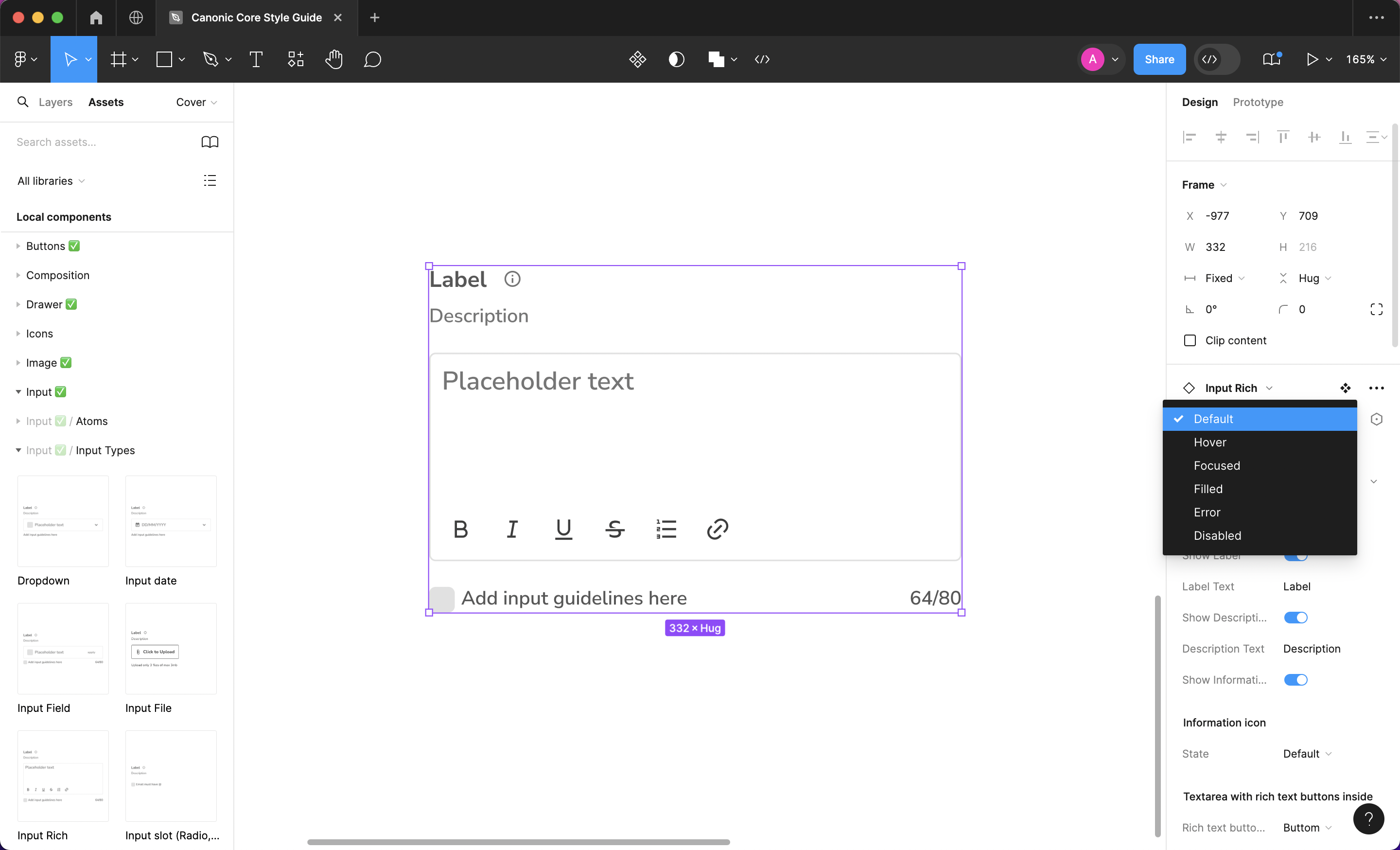
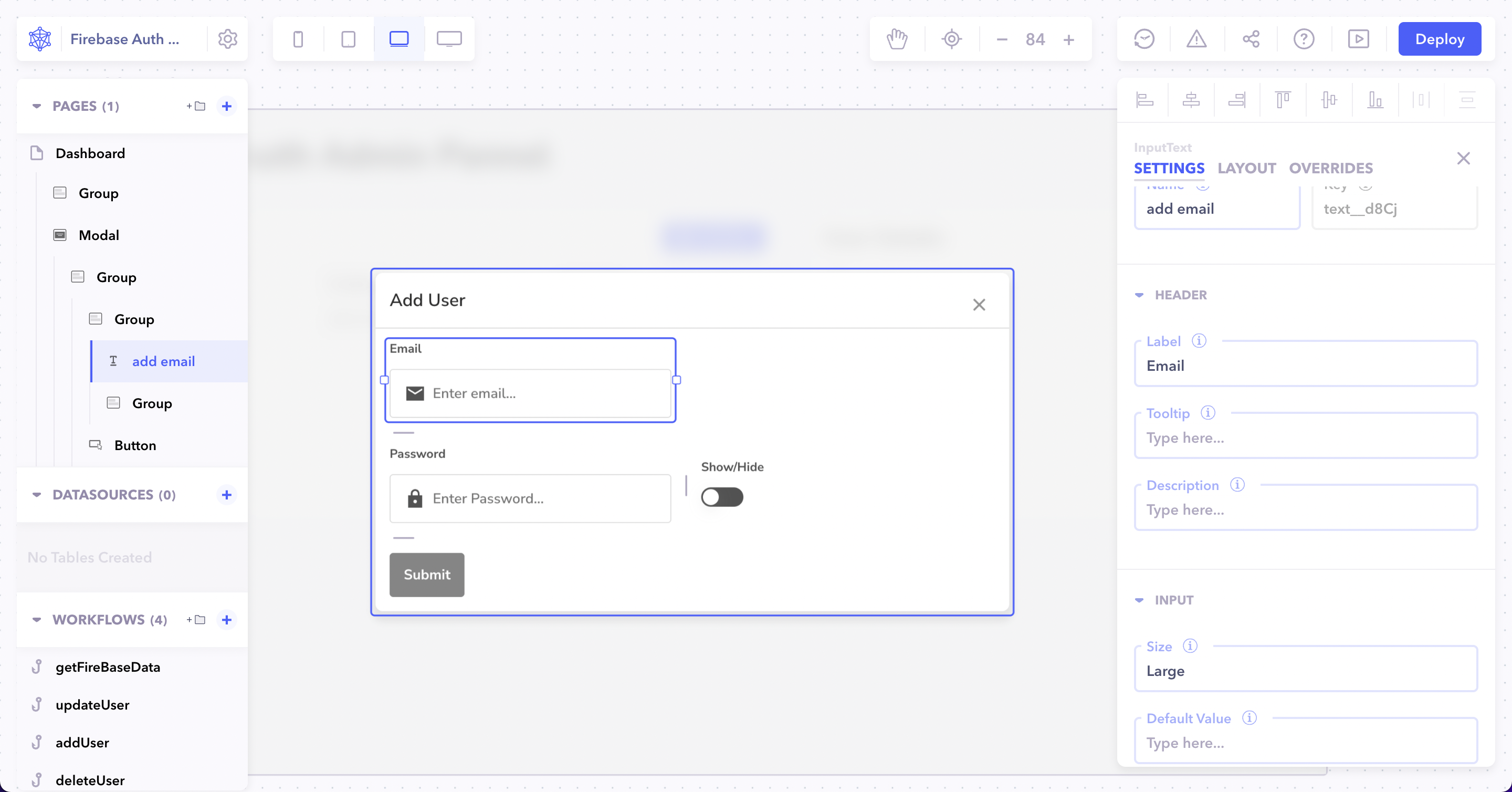
Platform
Component Configuration
Without writing any code build applications using Canonic's component library. Each component has plenty configuration capabilities.
Branding Configuration
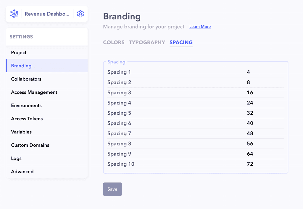
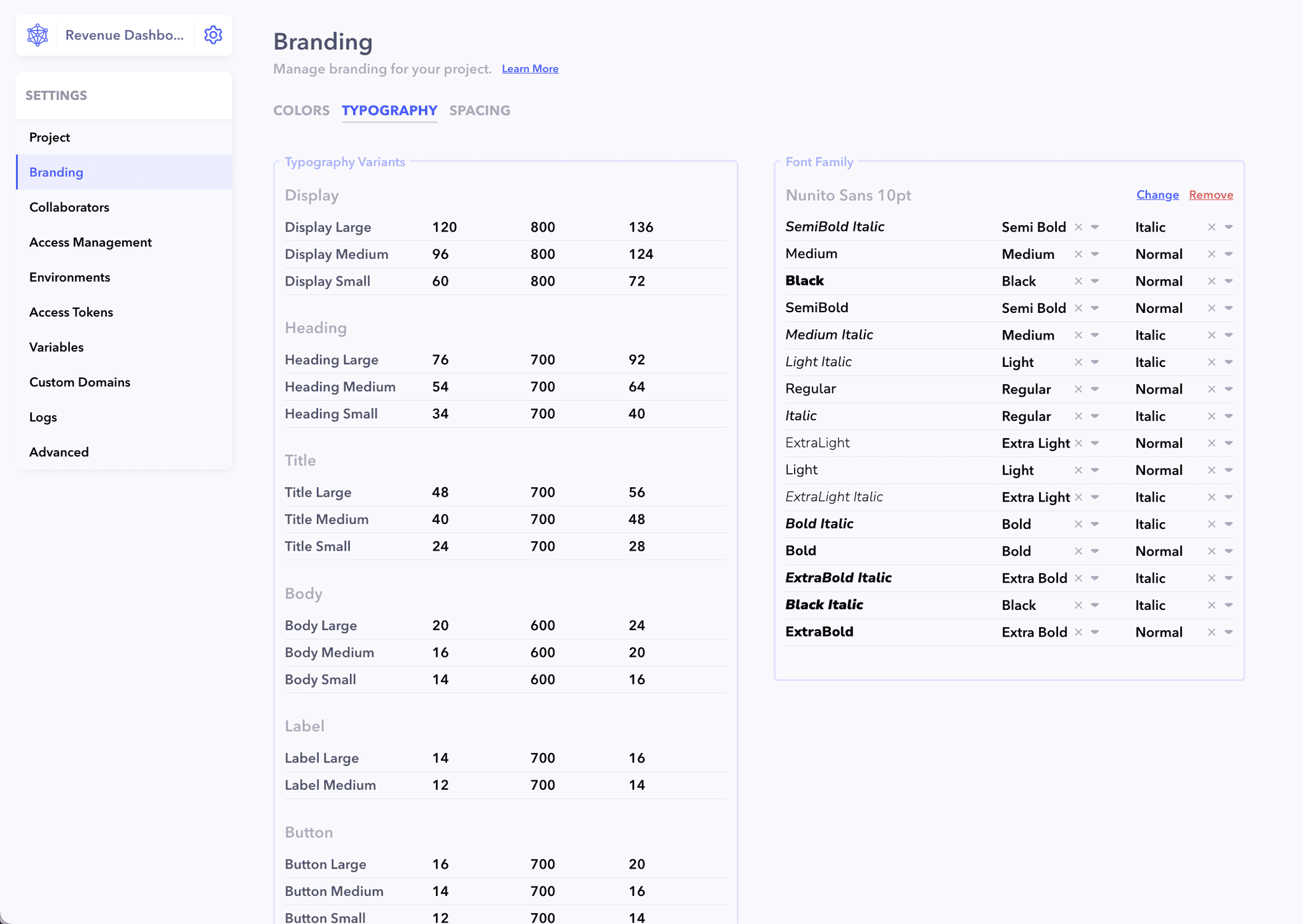
Easily customize the style guide from the Branding Settings section. Modify fonts, sizes, colors, and spacing values to align with your project's unique requirements, ensuring a tailored and cohesive design effortlessly.
Result
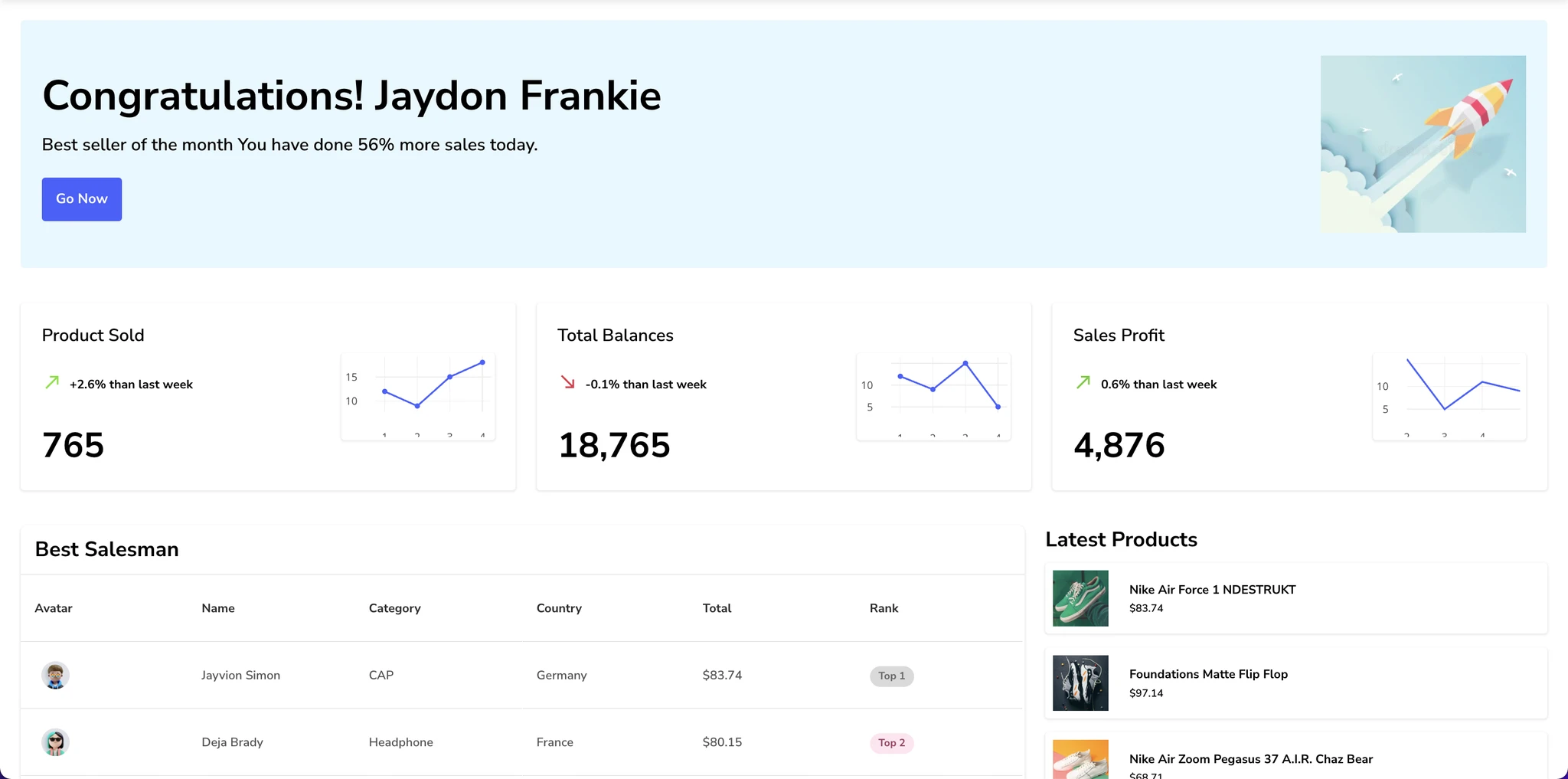
🔻 Reduced bugs by 80%
Standardizing components and interactions to reduce inconsistencies and bugs.
⚡️ Code Optimization by 500%
Optimizing code for better performance and maintainability.
😎 Better looking pages
Enhancing the visual appeal of pages through standardized components.
⚙️ Easier Configuration
Simplifying configuration and customization of components.
That's all for now folks! 🚀